01
Printing & tie-and-die
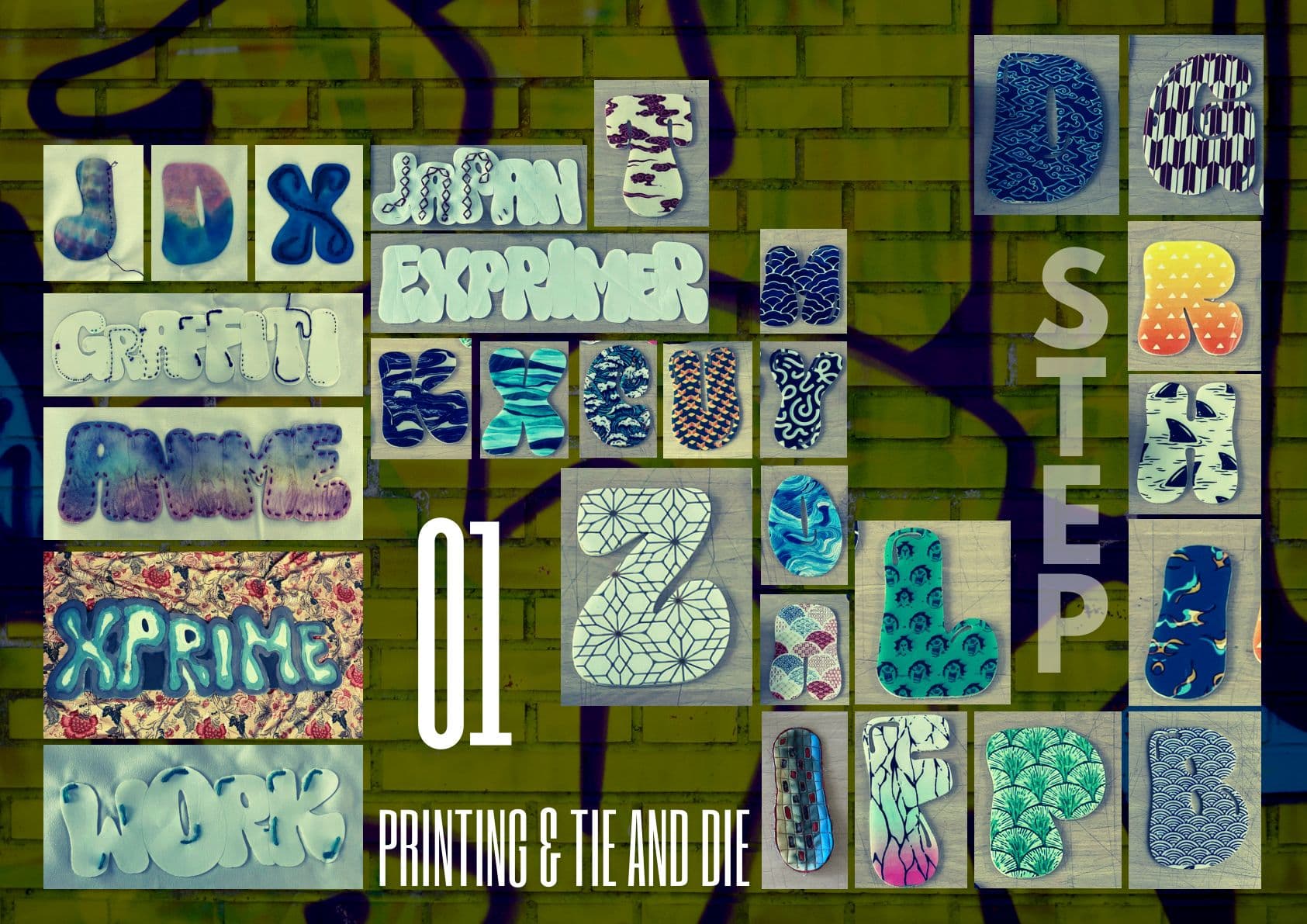
Graffiti alphabets are printed and tie-dyed onto flat cloth. At this stage the letter is still an image — something applied to a surface.
hold to spraytap to spray · scroll to quilt & puff it
Wall, ripstop & can: AI-generated materials (Higgsfield)
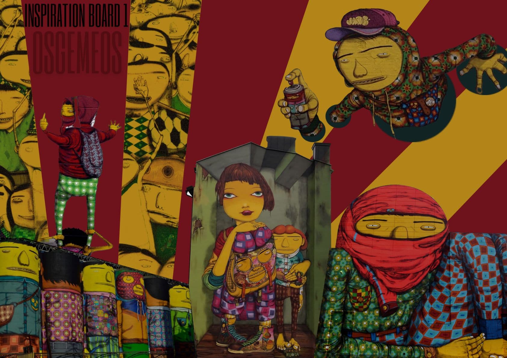
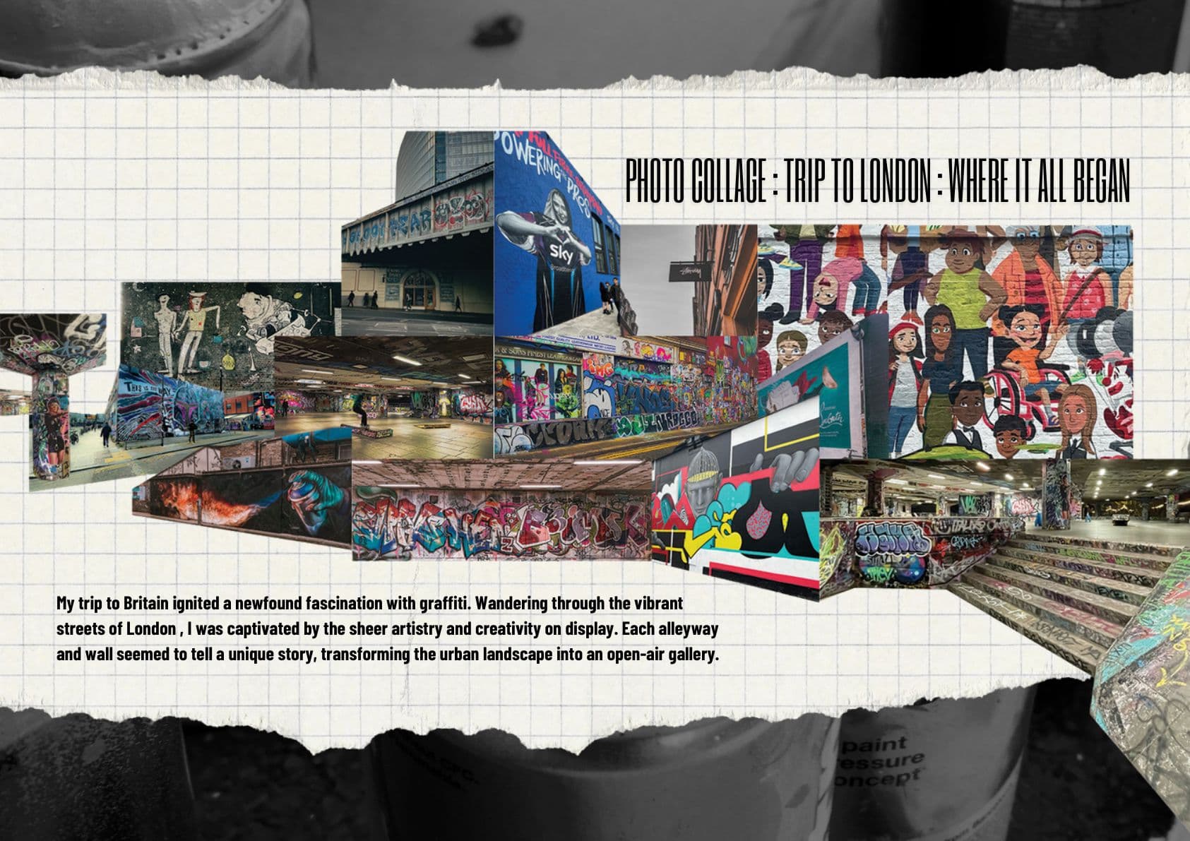
A trip to Britain lit the fuse. Wandering London, every alleyway and wall seemed to be telling a different story — the city was an open-air gallery that rewrote itself between visits.
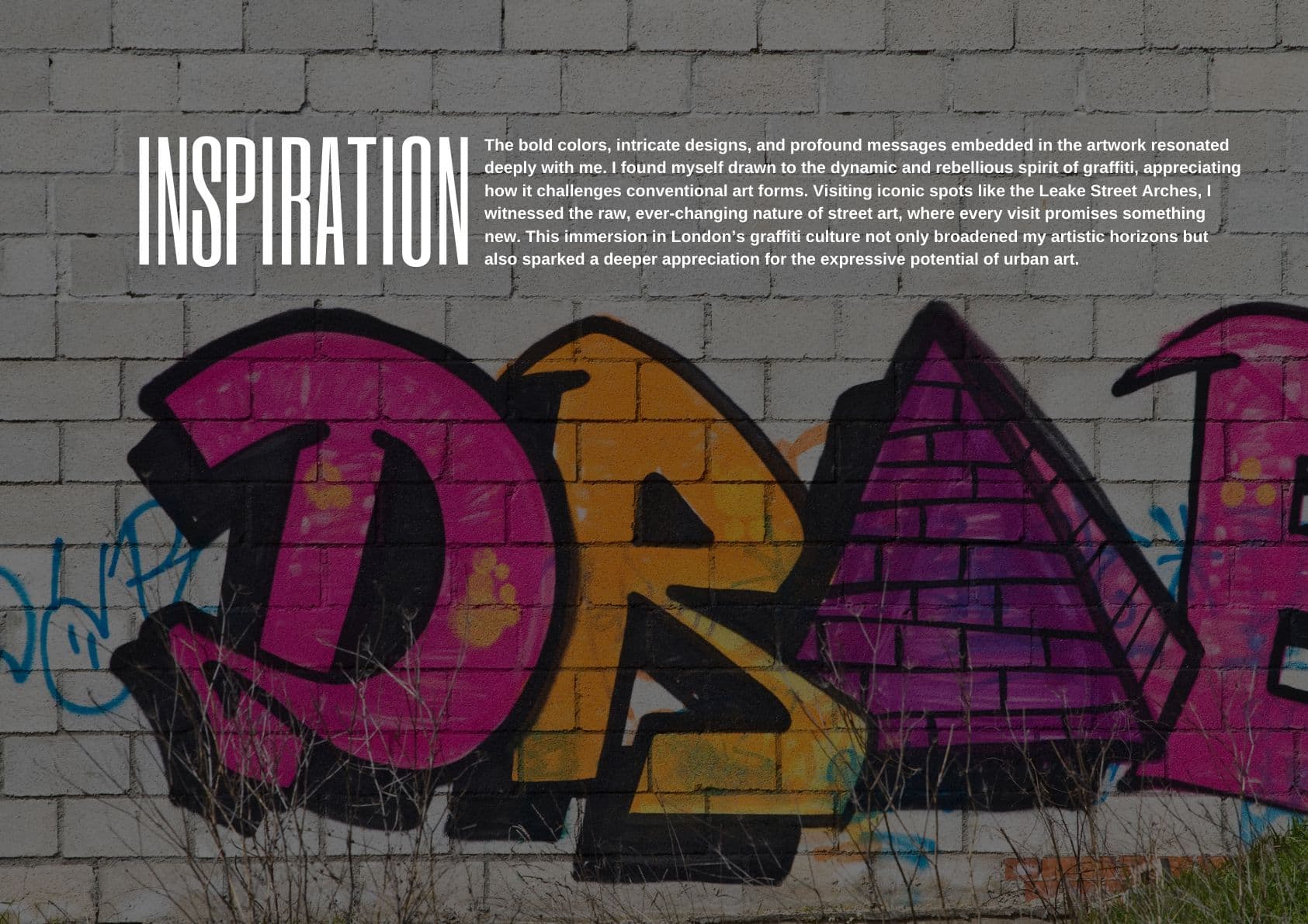
At the Leake Street Arches the work was raw and impermanent: painted over, painted again, never finished. That impermanence — art that refuses to sit still or ask permission — became the brief.
every wall a page, every visit a new edition
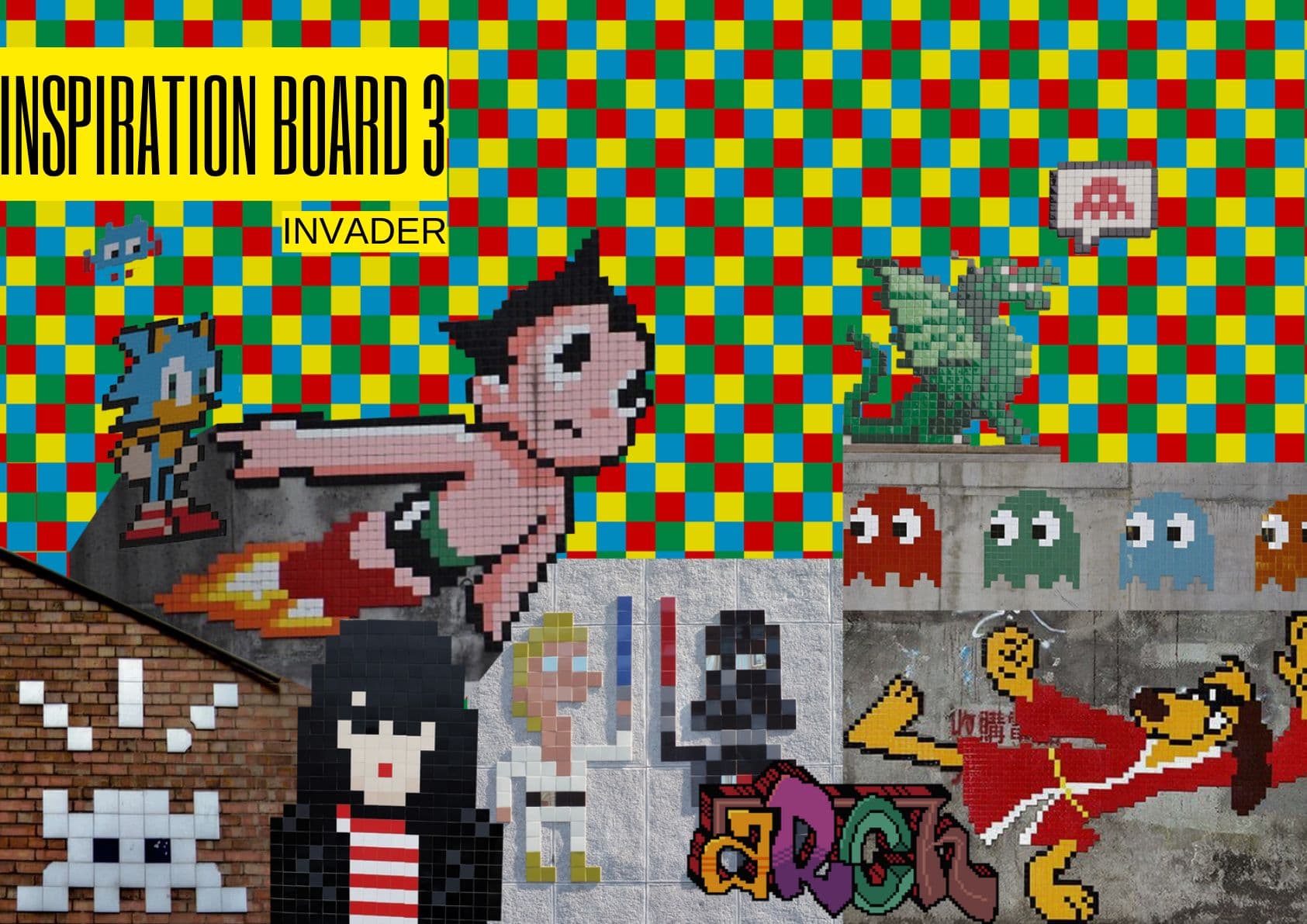
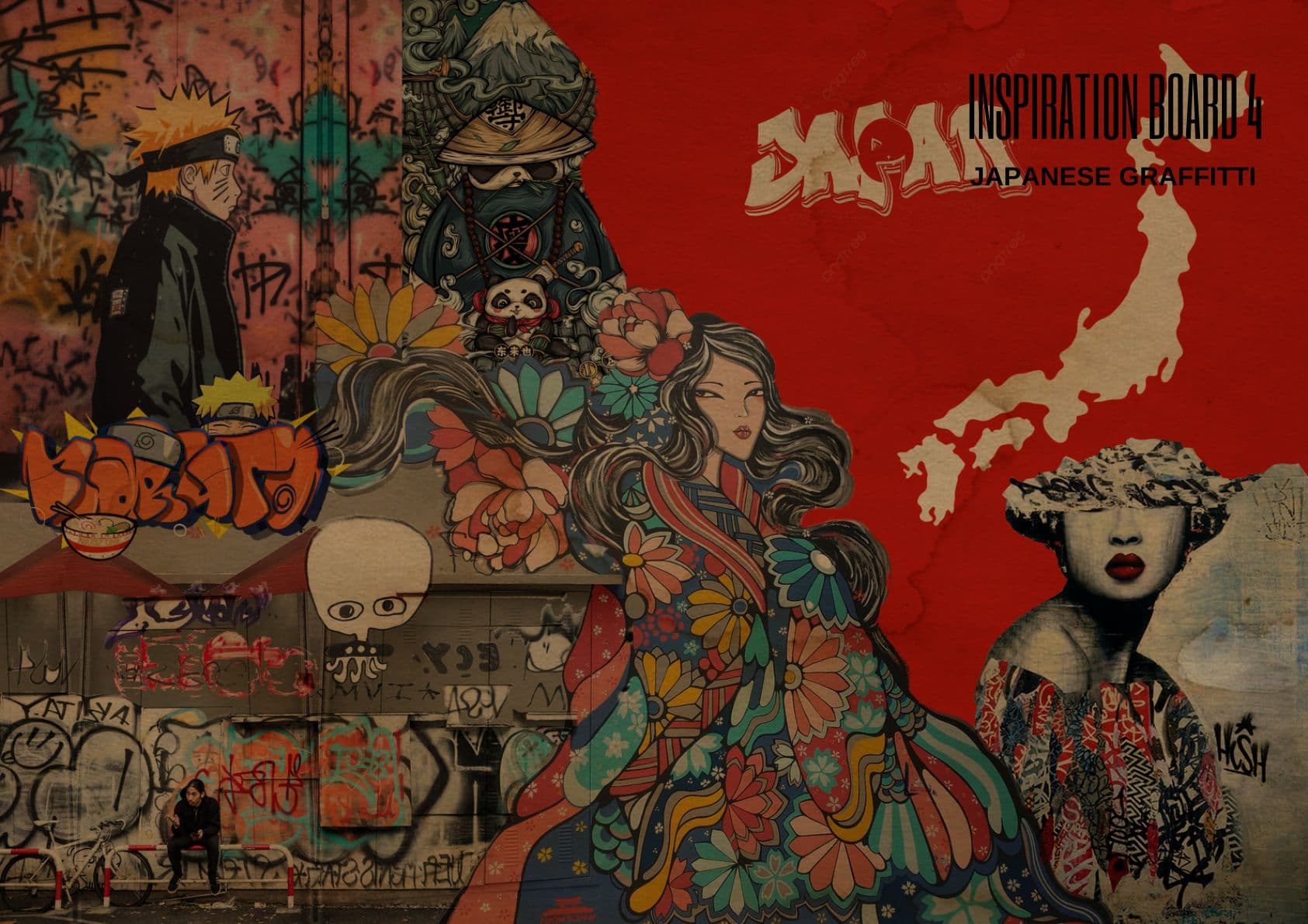
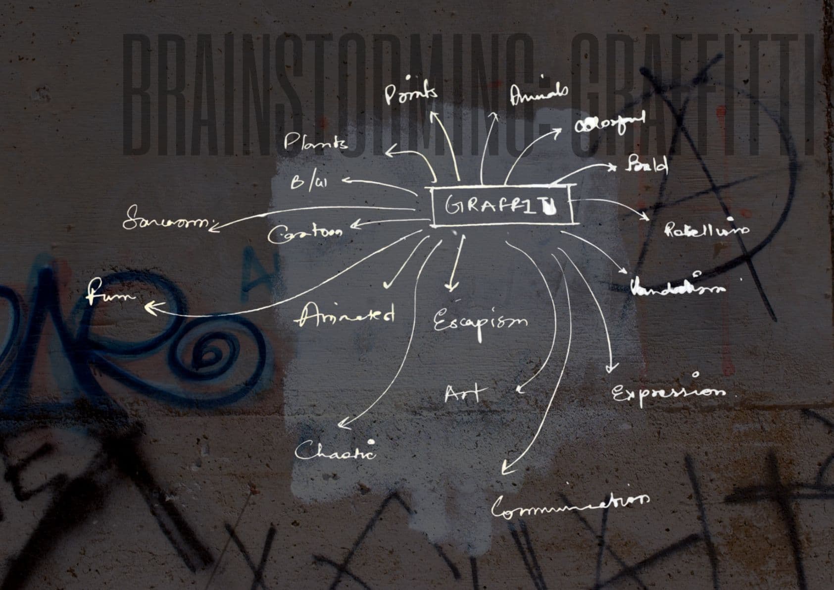
The whole collection unpacks from a single page of handwriting. Graffiti was pulled apart into everything it could mean — a vocabulary, not a style. Trace a thread to read it.
Hover a word
The graffiti alphabet is the foundation of the collection — every letter cut, printed and built into the garment itself. Taking it off the wall and onto the body democratises the form: no longer fixed to one surface in one city, it travels with whoever wears it.
the fabric letters spell exprimer — French, to express
The name of the label that came next was already here, cut in cloth on plate 25. See where it went.
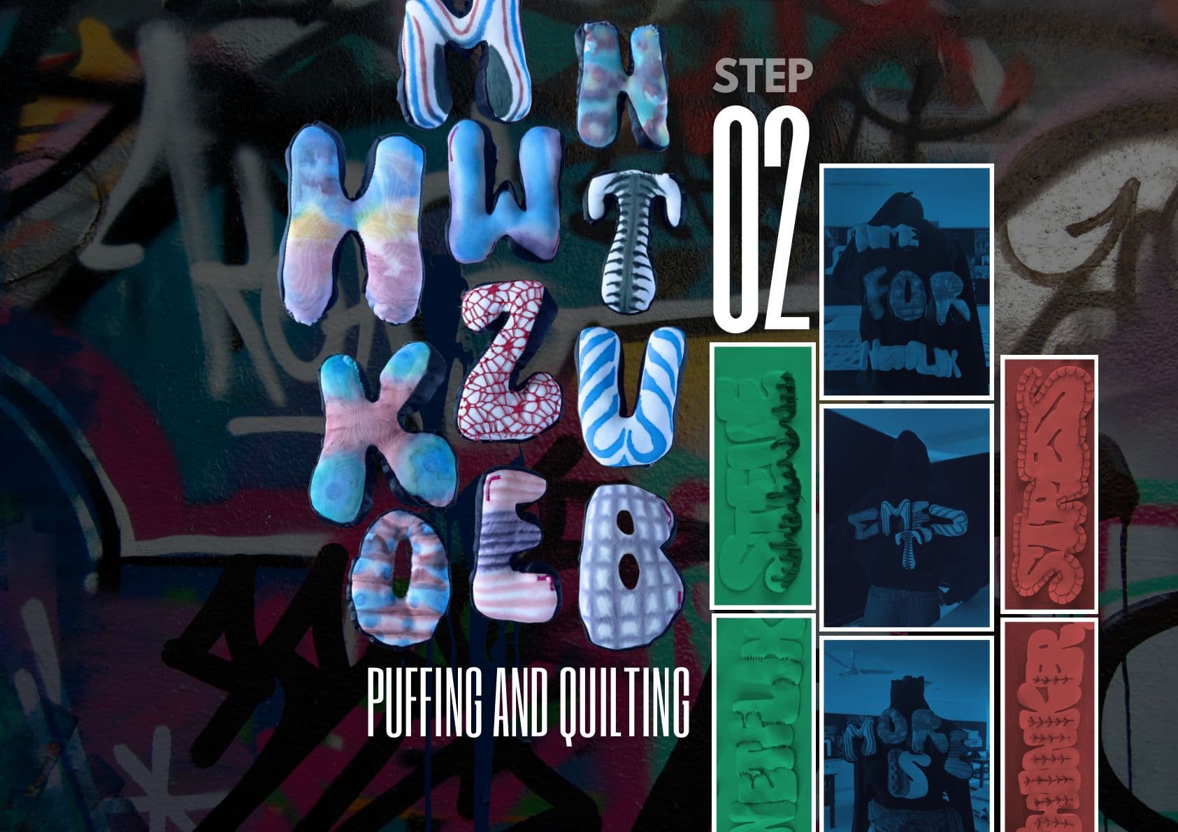
Three operations turn a printed graphic into a garment with volume. The letter never changes shape — only how much room it takes up.
Graffiti alphabets are printed and tie-dyed onto flat cloth. At this stage the letter is still an image — something applied to a surface.
The printed cloth is stitched into a grid. The letter stops being printed on the fabric and starts being built into it.
Each cell is filled. The letter lifts off the plane and becomes volume — a shape you can walk around.
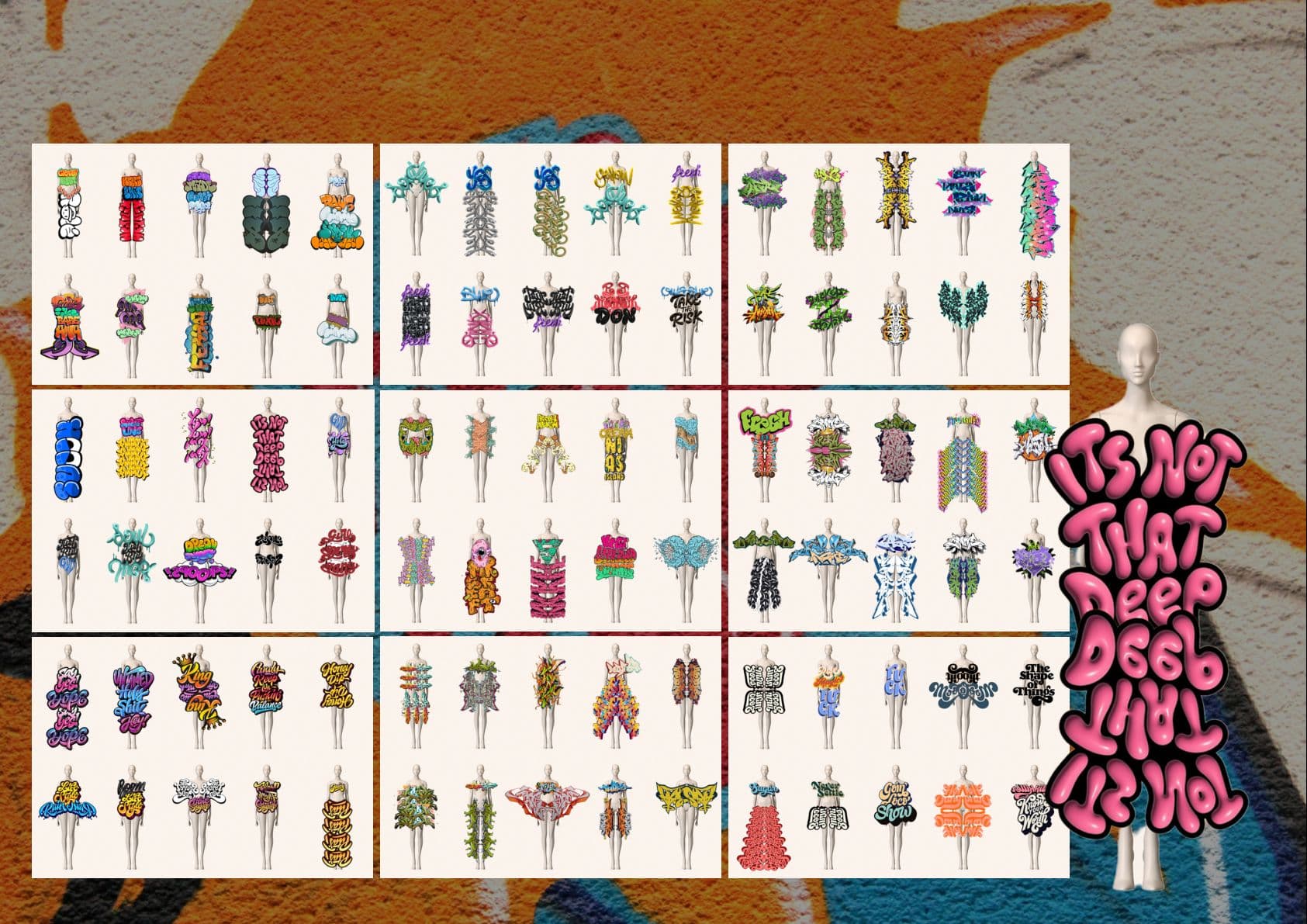
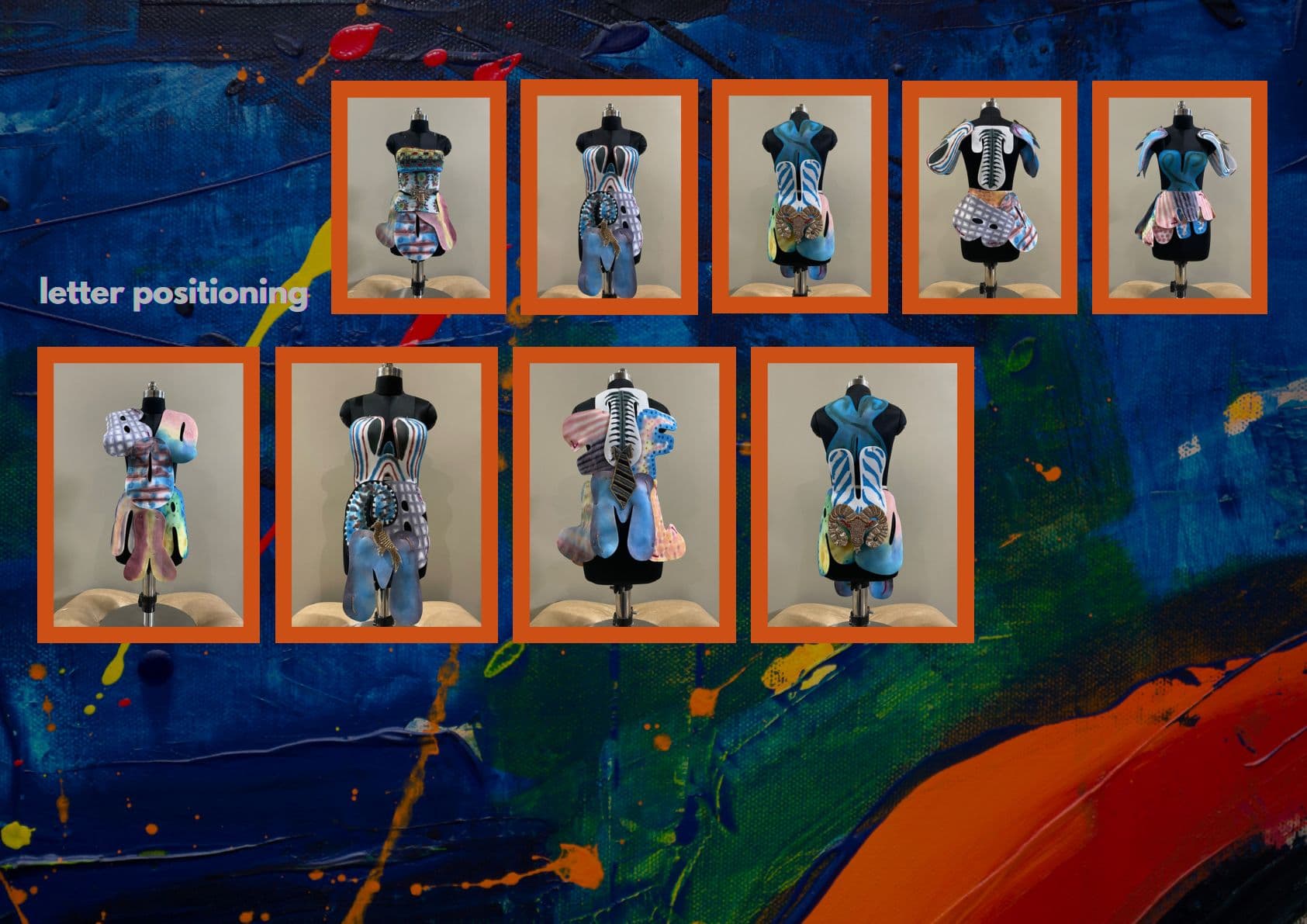
Letter positioning across nine dress forms. Twelve grids of croquis. Fourteen full ideations. The final collection is the residue of a very large amount of drawing.
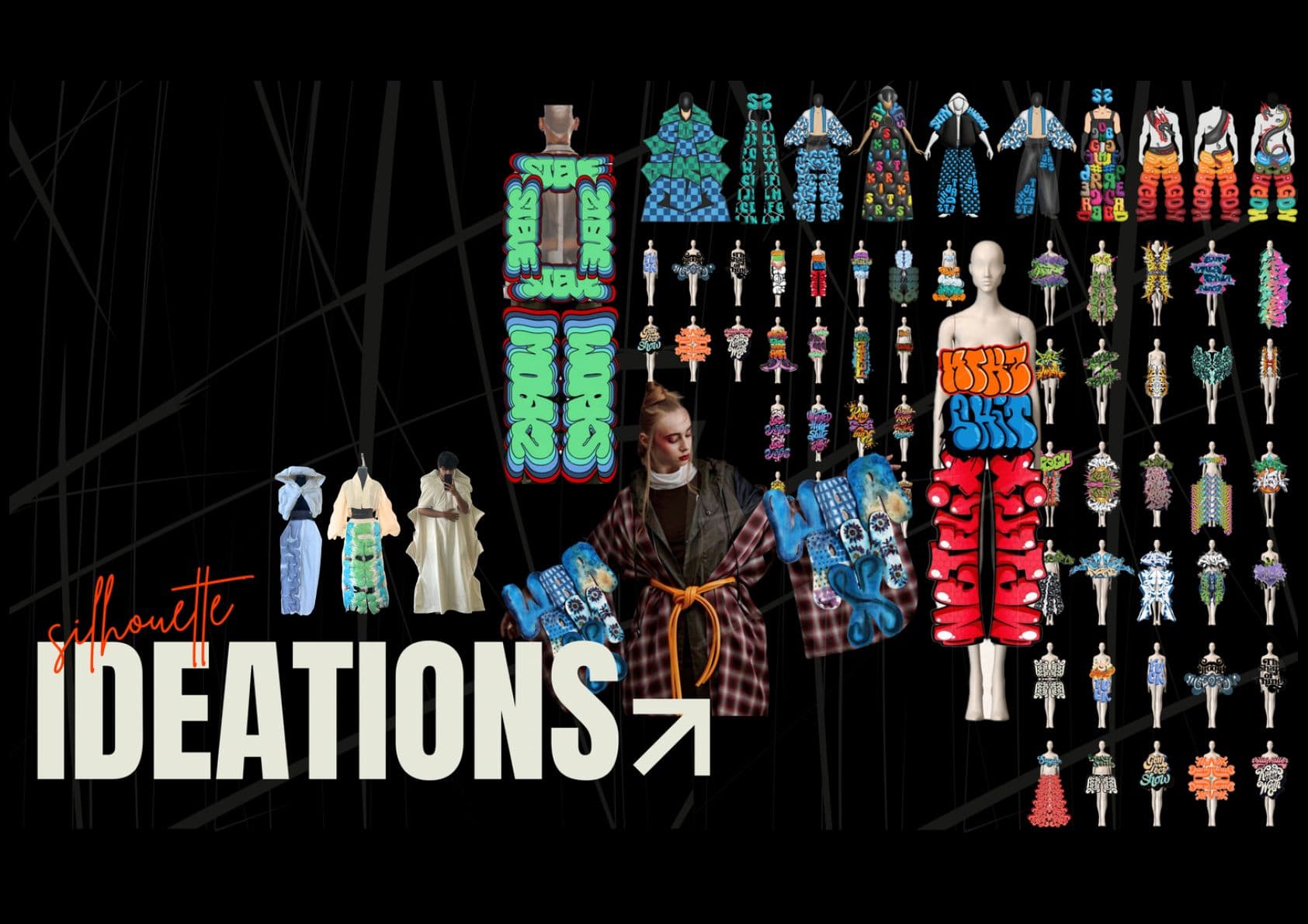
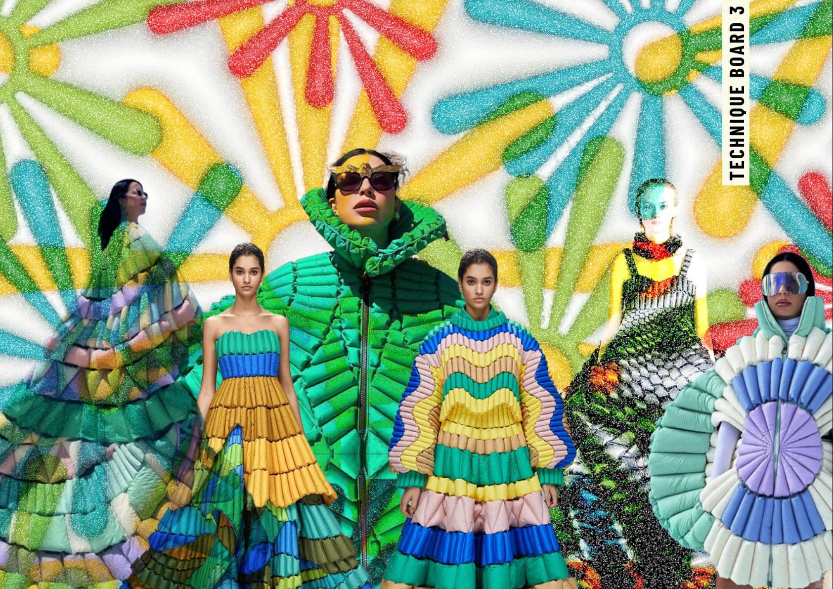
Printed, quilted, puffed. Shot cut-out on black, so the silhouette reads the way it was drawn — as a letterform standing up.
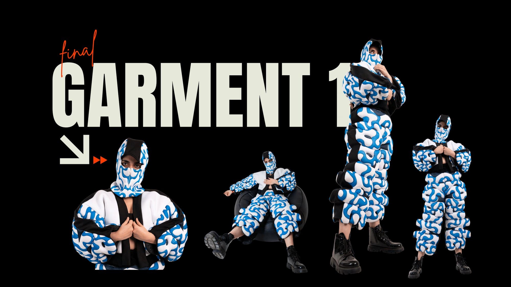
A full puffed suit and balaclava in cobalt and white. The scribble is no longer a mark on a wall — it wraps the body completely, head included.
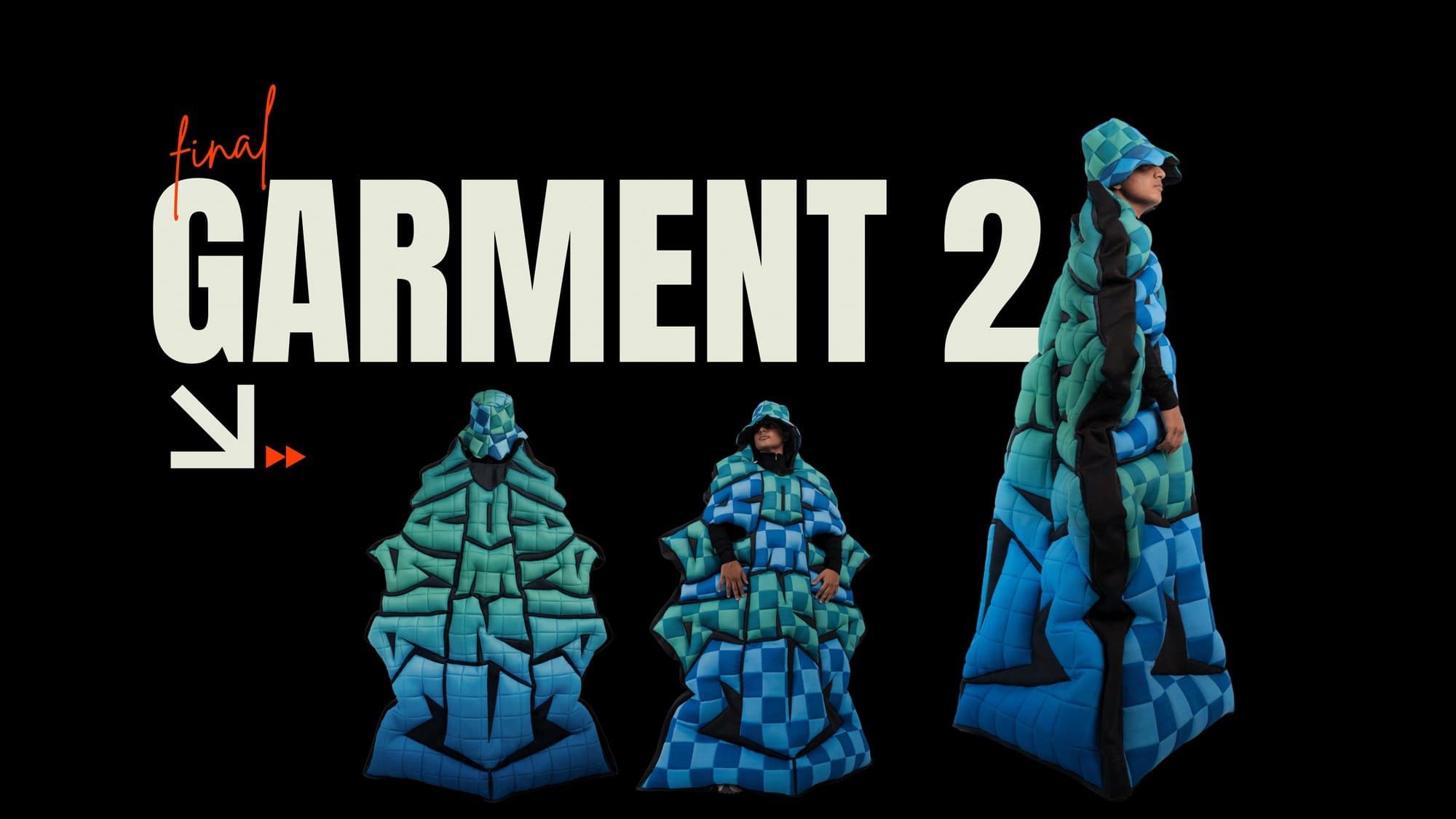
Checkerboard quilting stacked into an architectural silhouette. Read straight on, the garment is a letterform standing upright.
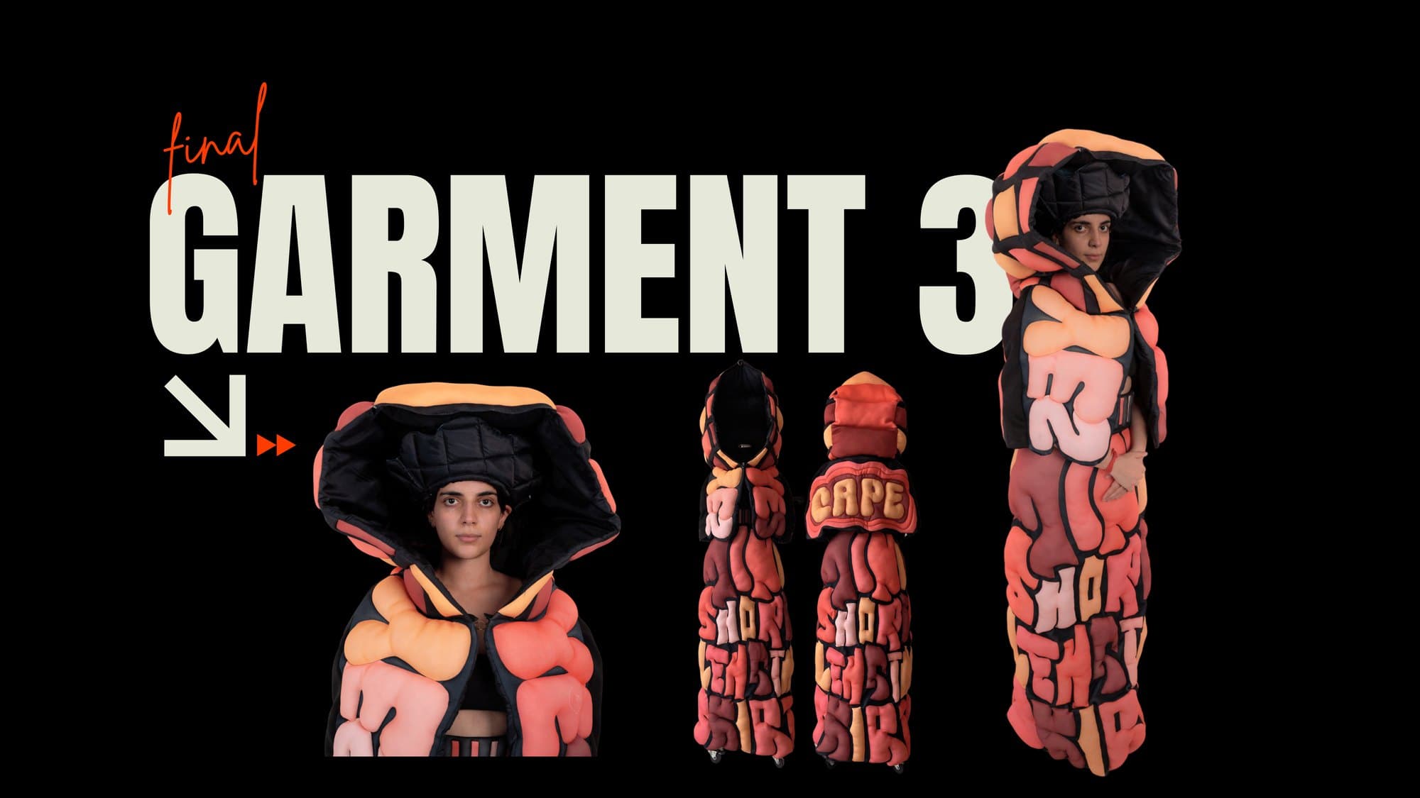
Puffed coral tubing spelling CAPE down the back. The garment names itself — signature and object at once.
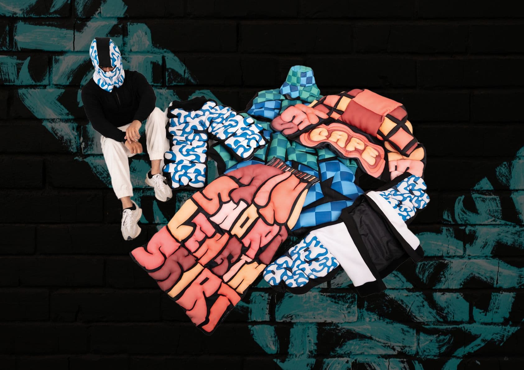
The collection set out to challenge what counts as wearable, and to hand the language of the wall to whoever puts the garment on. Graffiti stops being fixed to a place and becomes portable — carried, not visited.